Logo and Visual Identity Design for The Sand Architecture Firm
Logo and Visual Identity Design for The Sand Architecture Firm
The Sand is a distinguished architecture office specializing in the design and execution of architectural projects. Leveraging the expertise and creativity of its team, the firm delivers exceptional projects that consistently blend innovation with engineering precision.
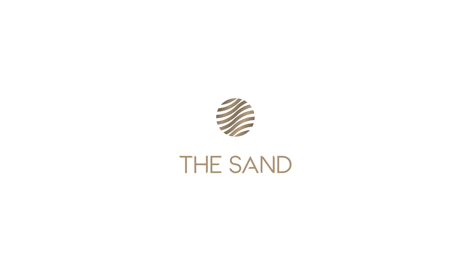
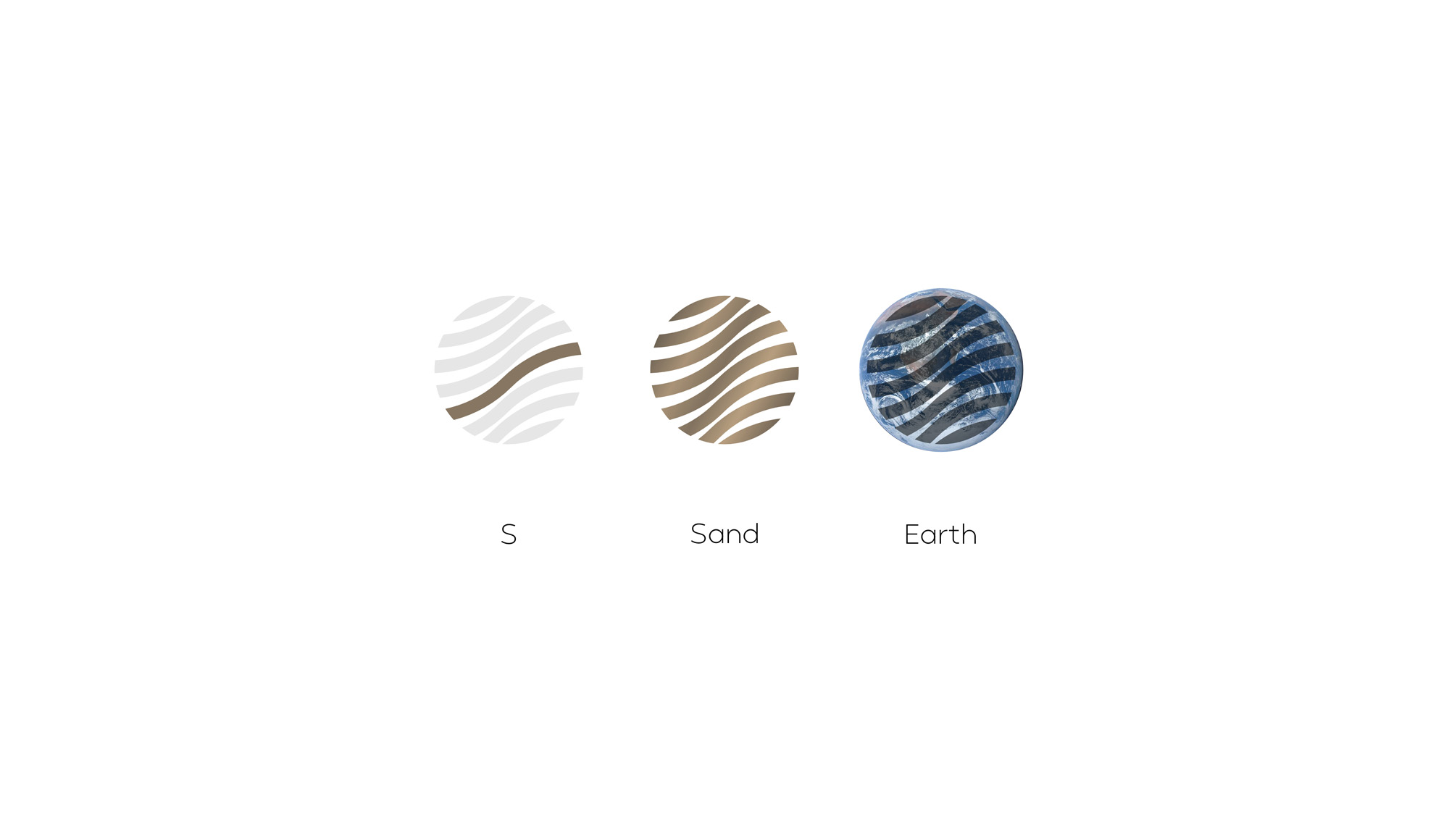
The logo design for The Sand cleverly incorporates four elements that collectively represent the brand’s identity and concept. The first element is the letter “S,” representing the initial of the word “Sand,” creatively integrated with other design components. The second and third elements symbolize sand grains and their spherical shape, which simultaneously allude to the Earth, highlighting the firm’s close connection to nature and the environment. The fourth element is the fluidity of the letter “S” and the zigzag lines in the logo, evoking the movement of sand shaped by the wind. These elements, presented in a minimalist and elegant style, convey themes of dynamism, movement, and flexibility in The Sand’s architectural designs. With this intricate yet simple design, The Sand’s logo effectively expresses the firm’s commitment to creating unique projects deeply connected to nature.