mahatna
Logo & Visual Identity Design for Mahanta Beauty Salon
Logo & Visual Identity Design for Mahanta Beauty Salon
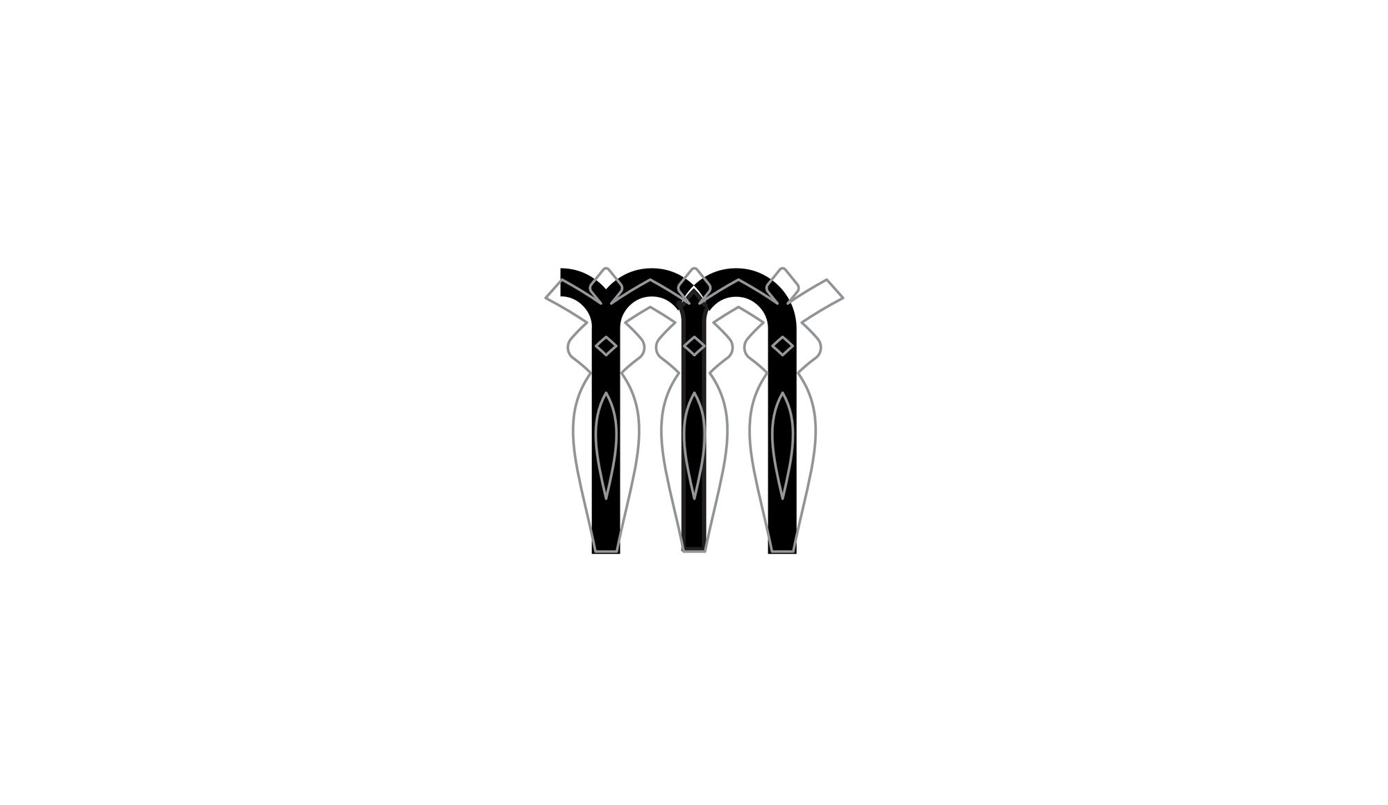
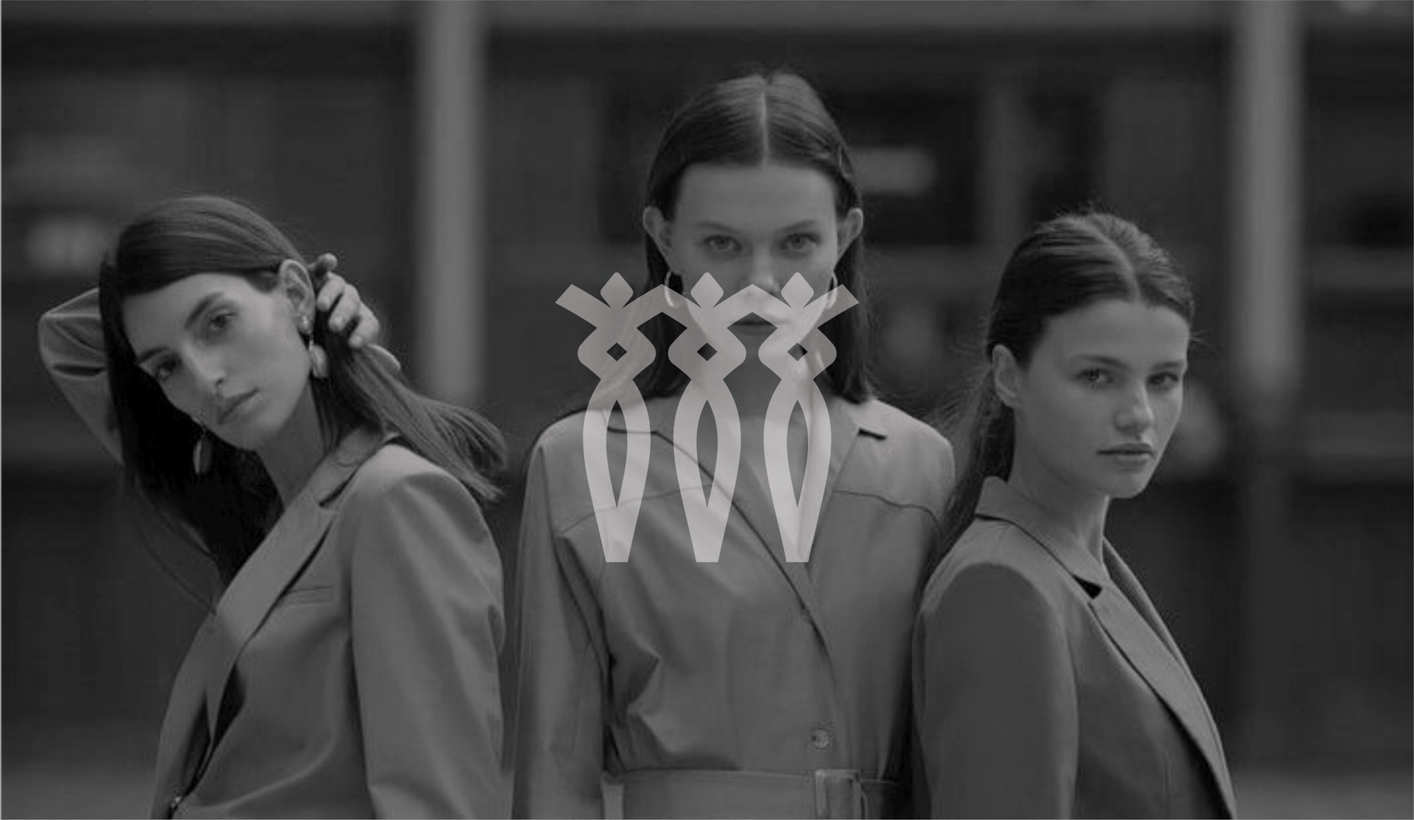
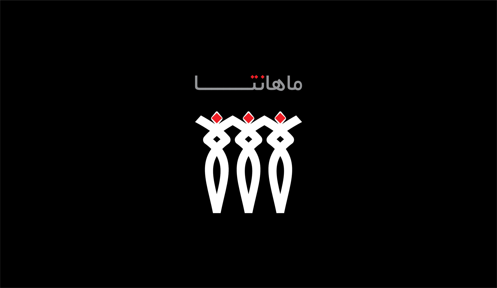
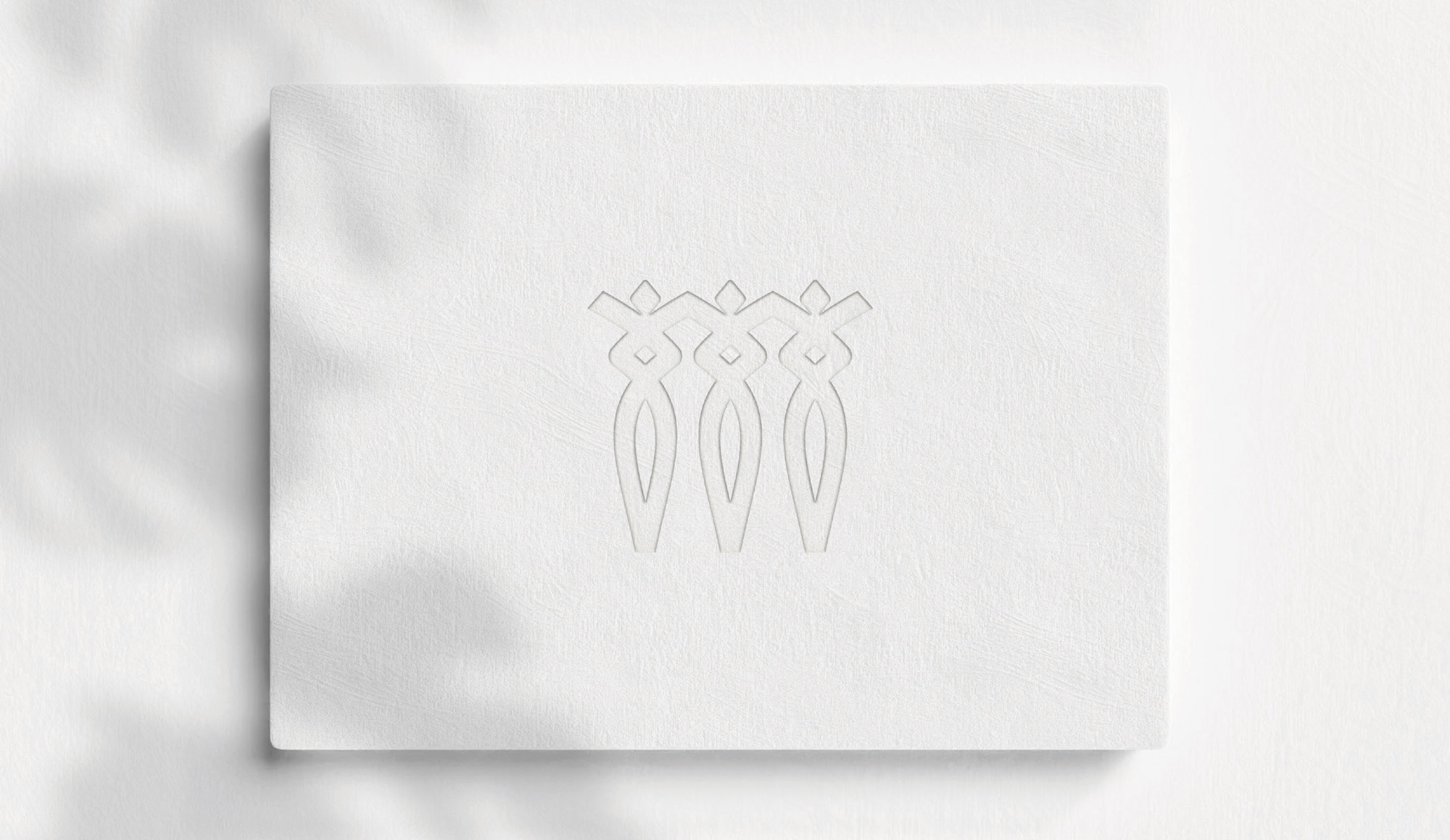
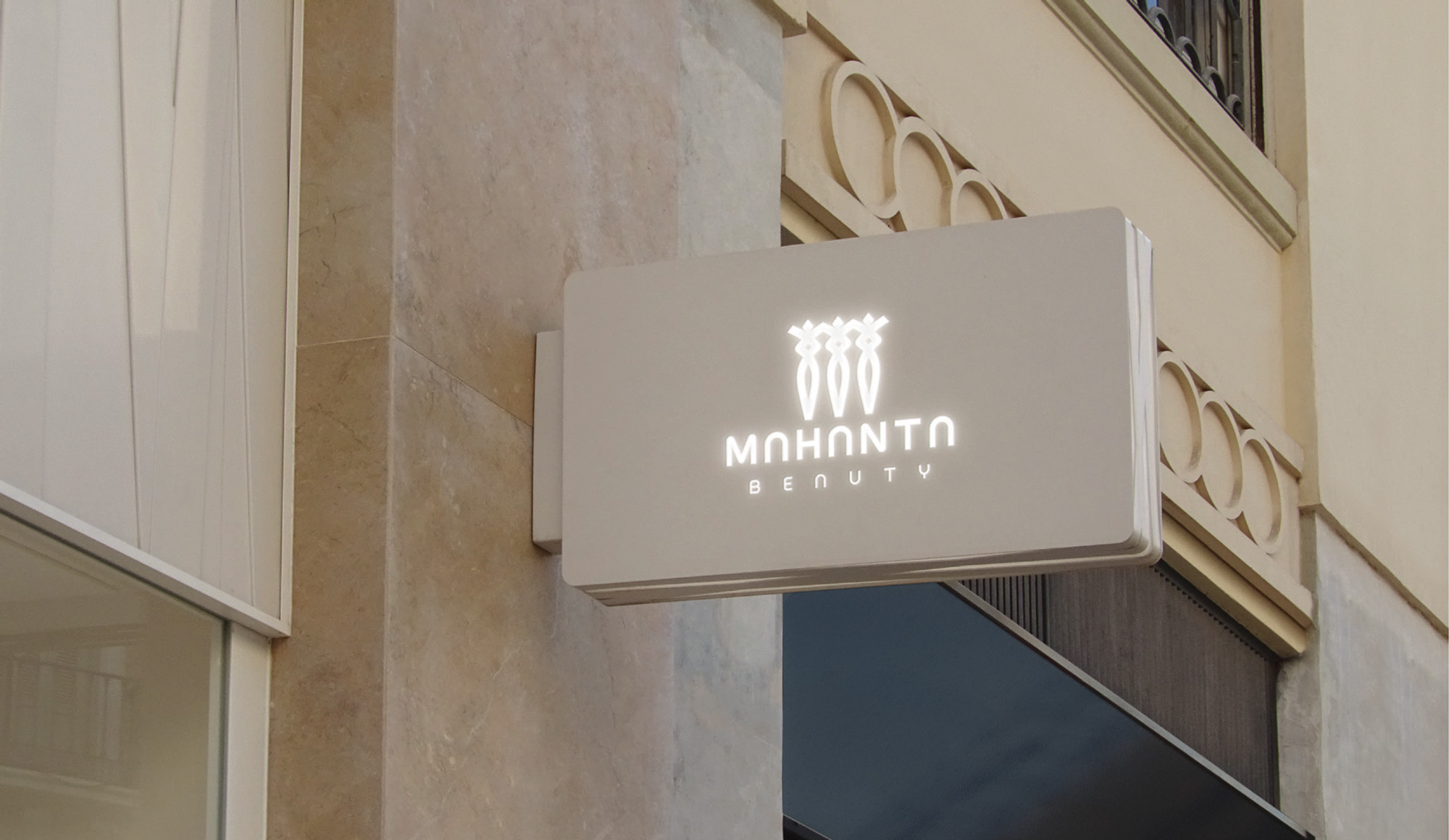
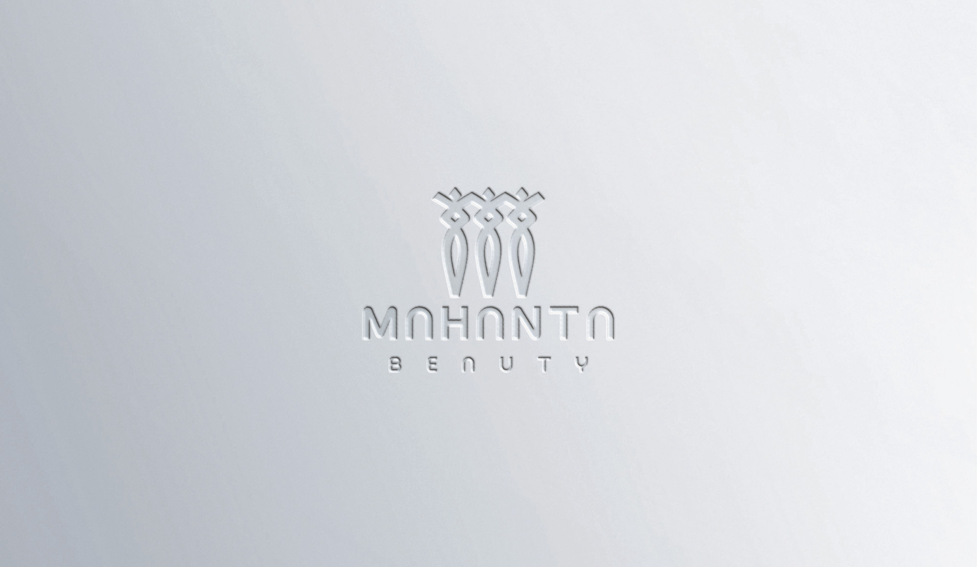
The Mahanta logo, representing a beauty salon and spa for women, incorporates three key elements that cleverly refer to the brand’s services and identity:
- Minimal Three Dots: The logo features three minimal dots that correspond to the three dots in the name “Mahanta.” These dots maintain simplicity and visual appeal while creating a direct connection to the brand name.
- Comb Shape at the Bottom: The lower part of the logo is designed to resemble a comb, symbolizing the beauty and hairstyling services offered by the salon. This element metaphorically represents beauty tools and conveys a message related to the salon’s services to the audience.
- Overall Female Shape: The overall design of the logo forms the shape of a woman, implicitly referring to the target audience (women) and the salon’s field of activity (beauty and spa). This feminine design subtly and creatively emphasizes the salon’s focus on beauty and services tailored specifically for women.
The combination of these three elements in the Mahanta logo successfully depicts the brand identity and creates a meaningful connection between the name, services, and target audience.