Home Holding
Logo & Visual Identity Design for HOME HOLDING Construction Holding
Logo & Visual Identity Design for HOME HOLDING Construction Holding
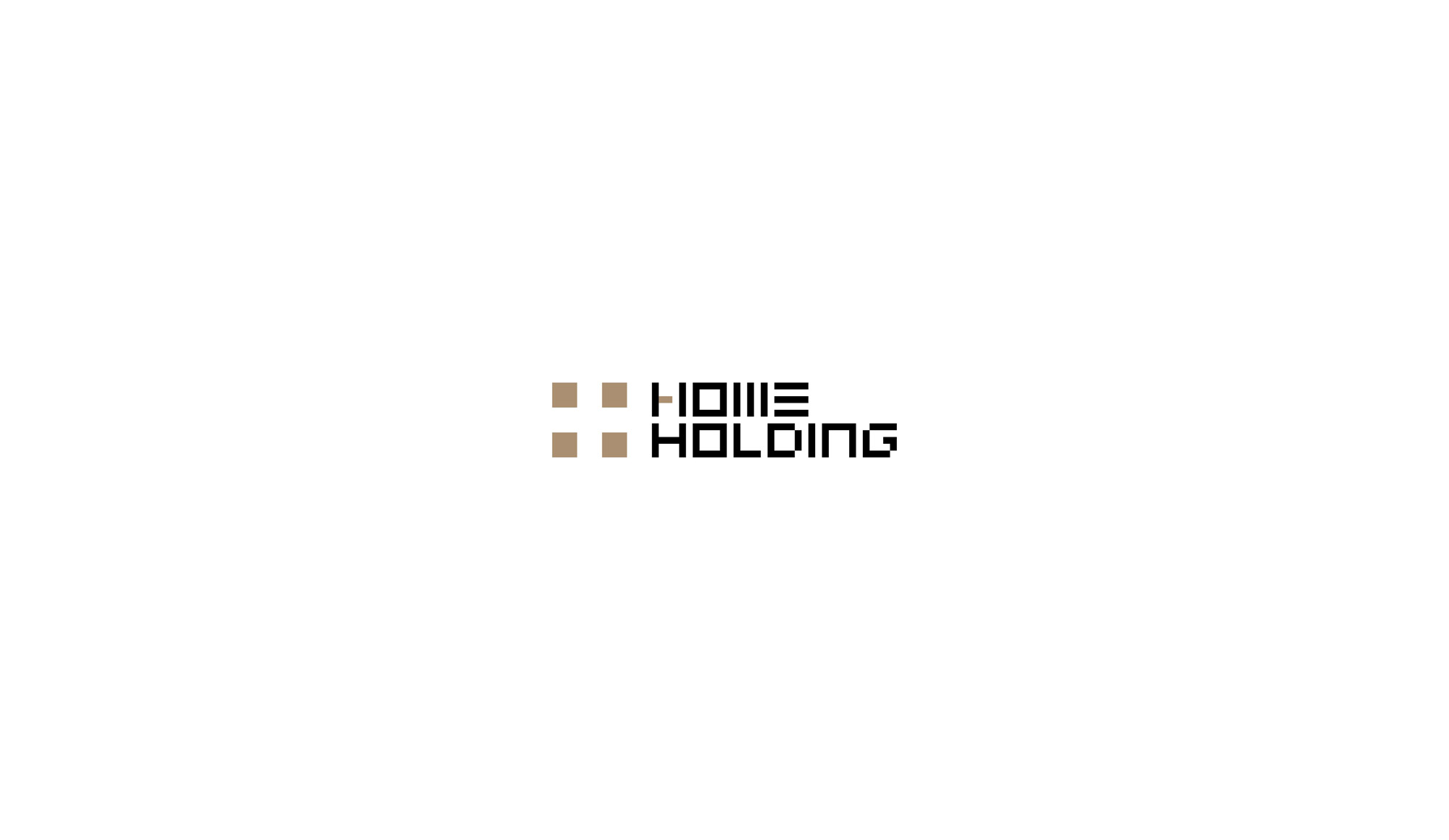
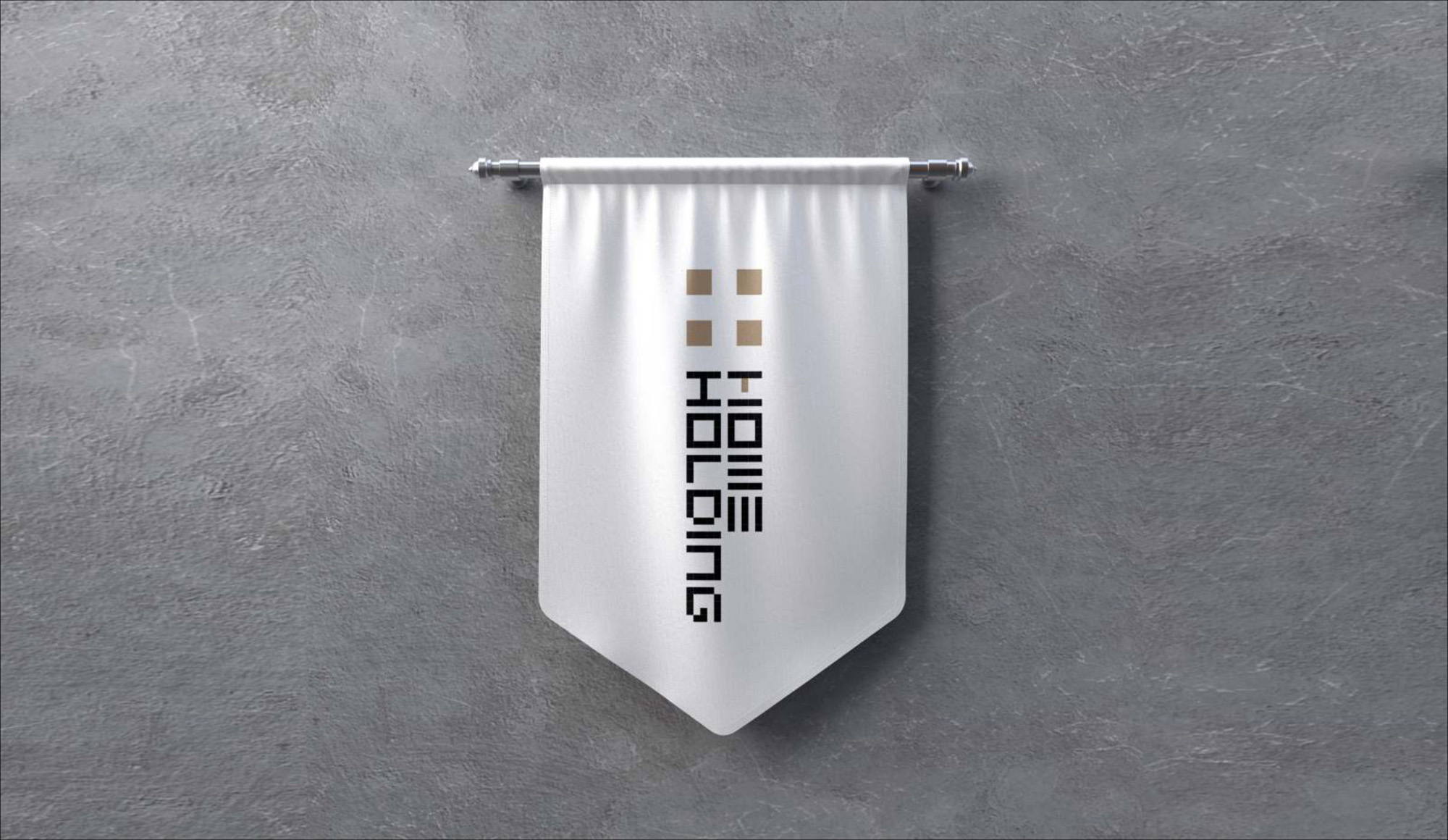
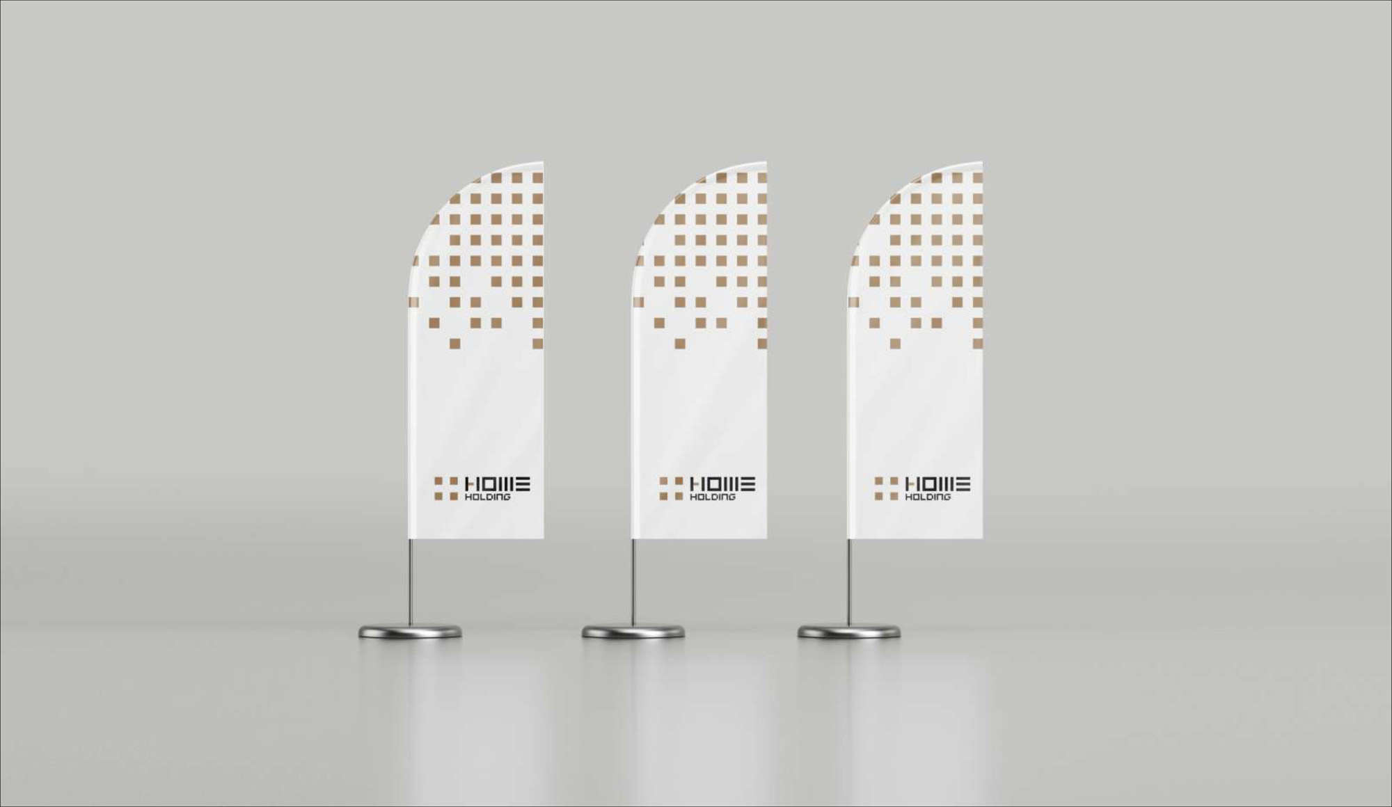
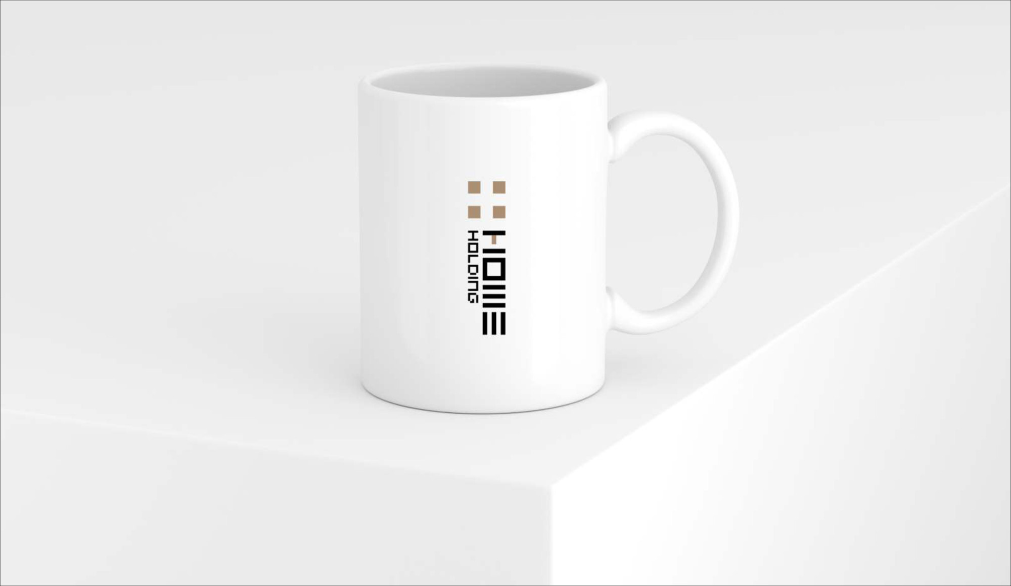
The Home Holding logo, representing a construction holding company and developer of luxury residential projects in Iran, incorporates several key elements that cleverly reflect the brand’s identity and its field of activity:
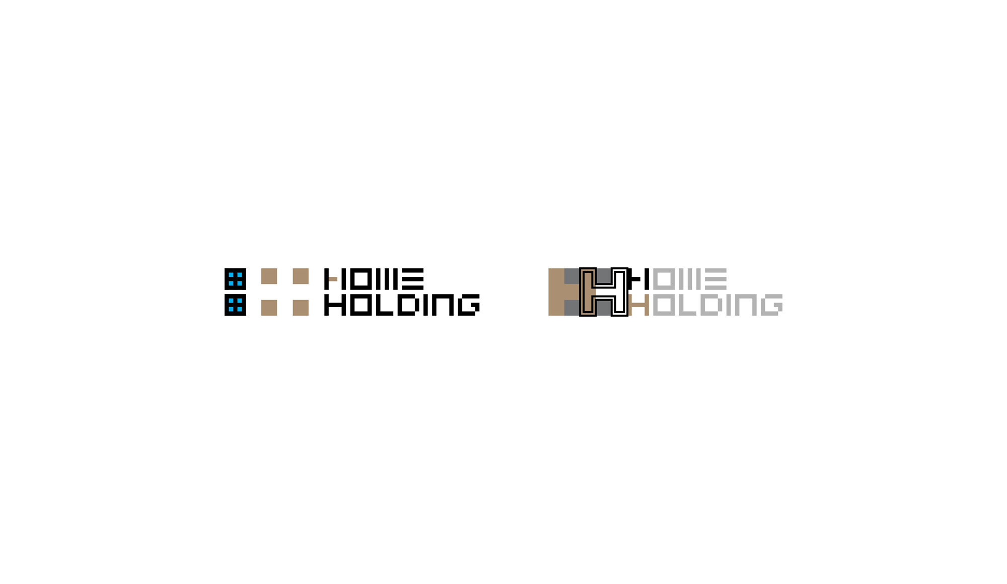
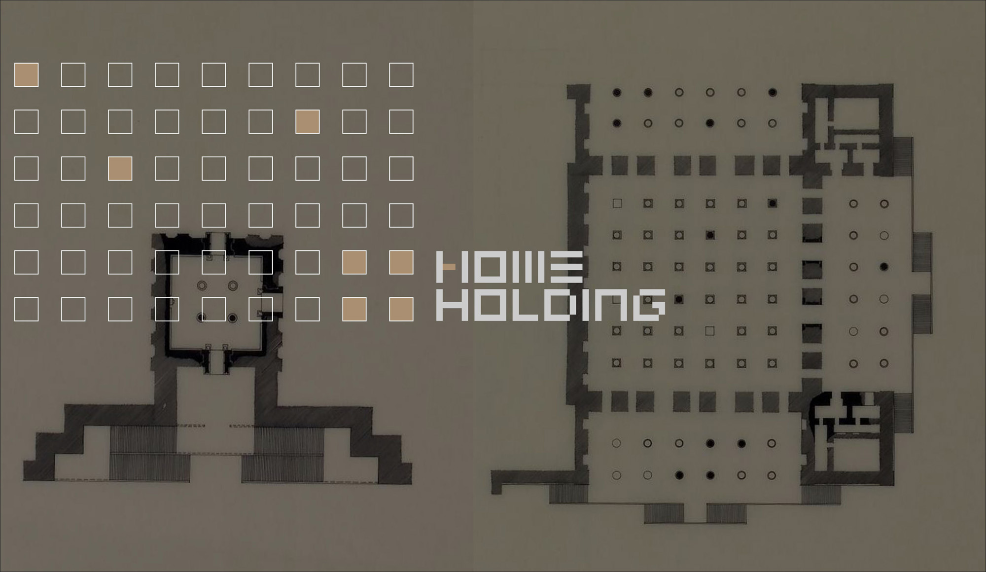
- Four Squares: The logo features four ochre brown squares symbolizing house windows, directly connecting to the construction and housing industry.
- Negative Space: The negative space formed between these squares is designed to reveal two letter “H”s, representing the initials of the brand name “Home Holding.”
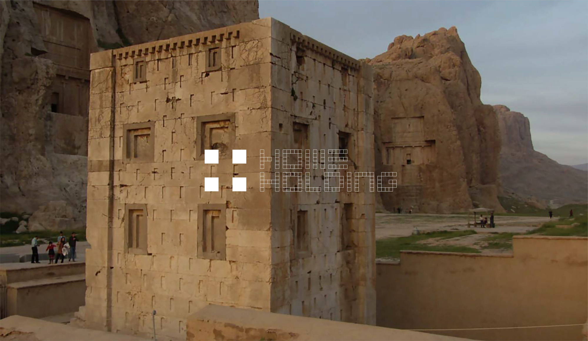
- Ochre Brown Color: The use of ochre brown specifically refers to colors seen in some ancient buildings and structures. This color choice symbolizes a connection between history and modern architecture, emphasizing authenticity and architectural roots.
In addition to the four squares and negative space forming the “H”s, the logo includes an English logotype. The font is chosen to convey professionalism and solidity, harmonizing with the overall logo structure. The logotype is simple and legible, effectively displaying the brand name alongside the visual elements.
Using simple and minimal elements, this design accurately and effectively portrays Home Holding’s brand identity and creates a strong connection between its construction activities and visual branding.