Logo & Visual Identity Design for Cafe Sakhteman Building Materials Distribution Company
Logo & Visual Identity Design for Cafe Sakhteman Building Materials Distribution Company
Cafe Sakhteman, a company in the construction and design sector, aims to deliver high-quality and innovative construction services, contributing to the development of building and architectural projects. The brand relies on a specialized team and the latest technologies to create efficient and beautiful spaces across various projects.
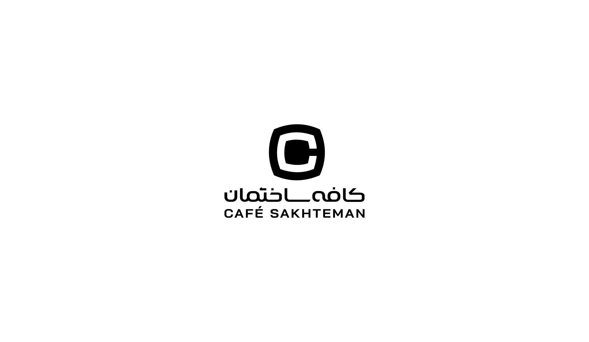
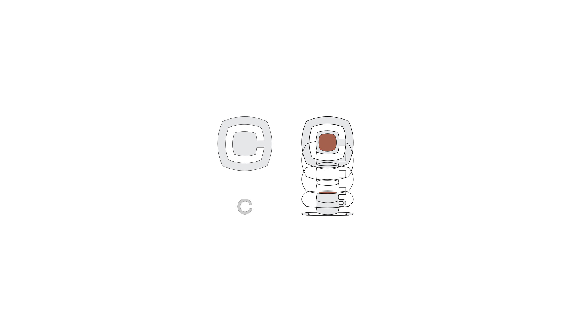
The Cafe Sakhteman logo features the letter “C,” the initial of the brand name. What makes this design unique is the use of the letter “C” as a representation of a coffee cup on a saucer.
At first glance, the “C” is recognizable as the first letter of the brand name. However, upon closer inspection, the logo creatively visualizes the “C” as a coffee cup and saucer. This design not only relates to the brand name but also indirectly evokes the feeling of comfort and relaxation associated with drinking coffee. This design choice effectively combines the identity of Cafe Sakhteman with its personality traits, including precision and innovation in providing construction services.