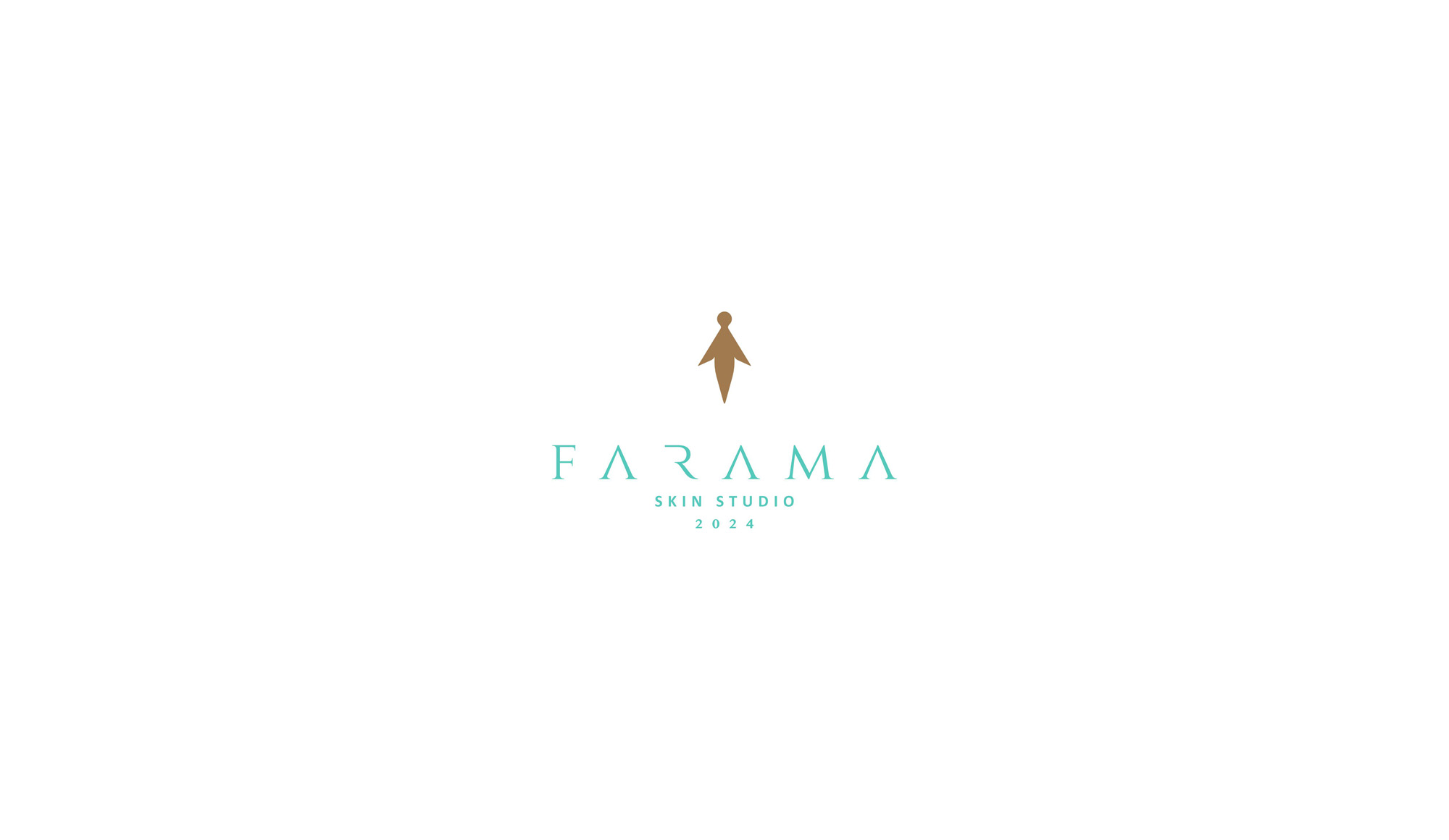
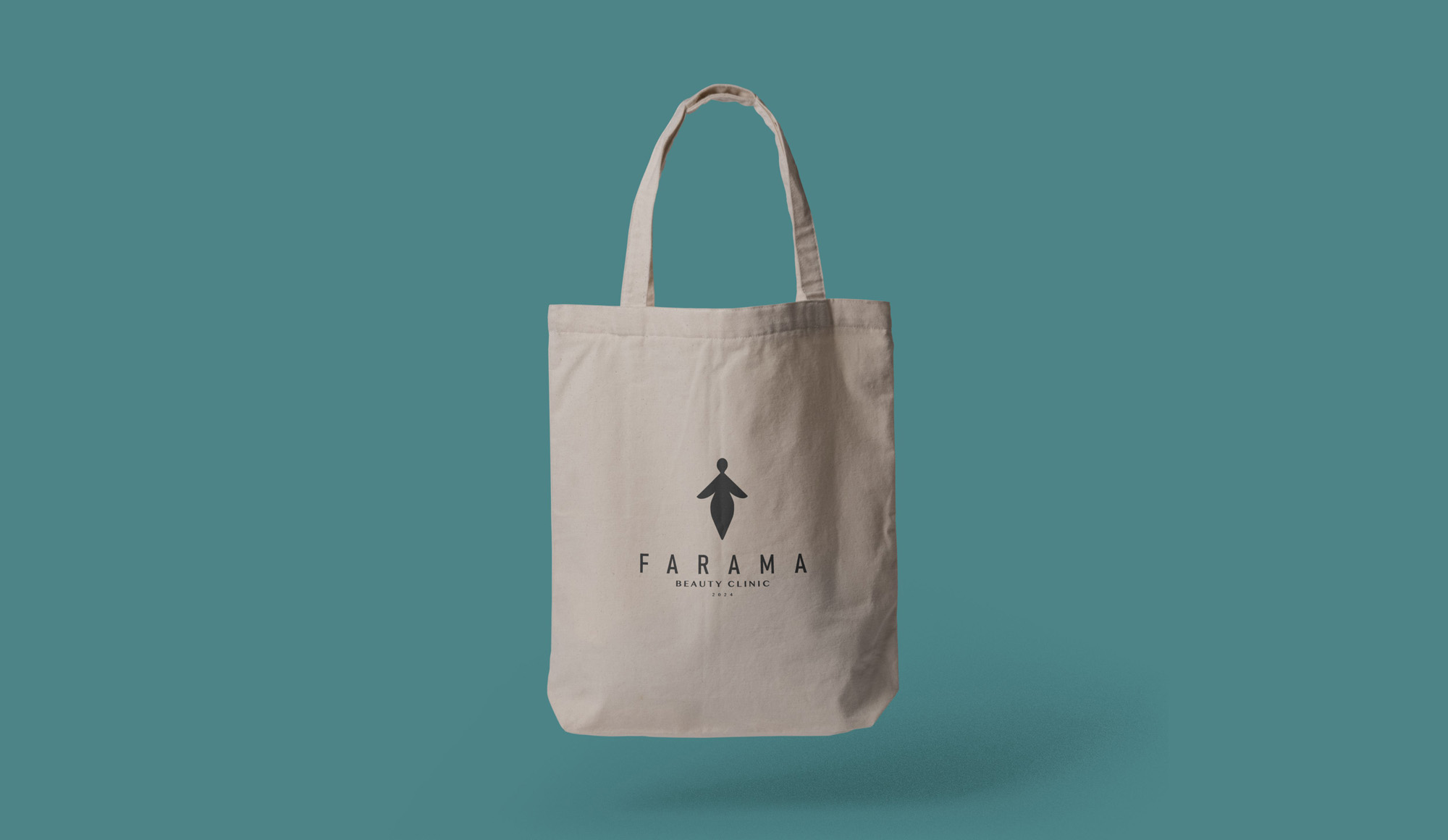
FARAMA is a skincare studio based in Mashhad that offers beauty and skin treatments with a strong emphasis on using natural and eco-friendly ingredients. The logo design for FARAMA follows a multifaceted and conceptual approach, simultaneously referencing three key elements:
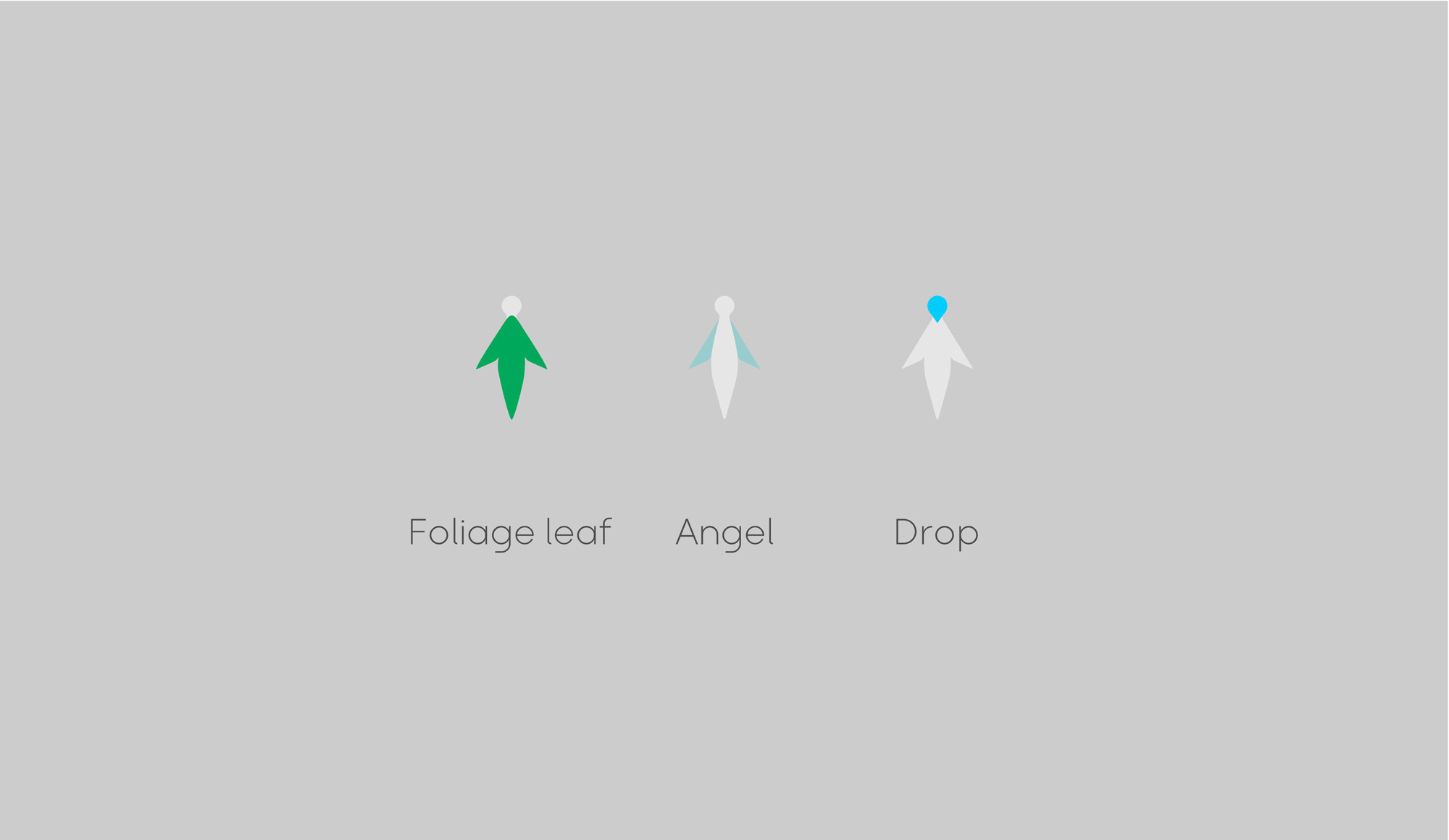
Leaf: Representing the natural essence of FARAMA’s products, the leaf symbolizes the beauty and clarity found in nature. It highlights the brand’s commitment to natural ingredients and their beneficial effects on the skin.
Angel: The angel symbolizes purity and beauty. This element reflects the sense of softness and elegance that FARAMA aims to provide for its clients through its services.
Water Drop: The water drop stands for clarity and purity. It refers to the importance of hydration and the revitalizing effects of natural skincare products, emphasizing the freshness and energy that FARAMA delivers.
The combination of these three elements in a clean and artistic minimalist design effectively communicates the brand’s identity and its core message to the audience.